Frank Hruska's Trivial Information

Just another WordPress site

  • Sample Page

Project #1 Reflection

Posted by FHruska on November 1, 2012
Posted in: Project 1. Leave a Comment

There were pros and cons to how I contributed to the wiki.  Beyond what I was required to type for class I was put in charge of the formatting and editing.  I am familiar with digital writing but building a wiki was a new concept for me.  I picked it up quickly but I feel this wiki builder was not user friendly.  I say this because a lot of the advanced design options I would have liked to explore were simply not offered.  With this said it become painful going through all the pages trying to make them look as familiar to the other pages as possible.  Since everyone was providing different content and posting it in a different way it became a tedious task.  I gained an appreciation for the Wikipedia community as Wikipedia is highly standardized and everything is formatted relatively the same.  I had trouble formatting and editing under a hundred pages I cannot imagine trying to fix Wikipedia with its hundred million plus pages.

The thing I am most proud of about the wiki is the fact we finished it.  Most of us have never been involved in an office environment in which a large group of people need to collaborate to finish a project.  From personal experience I have seen project groups waste a week or two deciding on what font and format to use in technical writing.  Hence, the fact we even managed to pull this together is impressive as I have little experience with building a wiki which I believe I am not the only one unfamiliar with building a wiki.  I was put in charge of making the wiki look presentable in terms of formatting and editing.  Finishing on time is what I was most proud of again as I took on the task because I like the presentation side of digital writing.  I am a firm believer that the presentation is equally if not more important than the content.  I started to struggle when I realized the content being posted did not correlate to other pages.  Wikipedia has a set model for people to follow we had a loose model which made figuring out an effective format difficult.  Also, as a lot of online communities type like they are online the editing process requires a lot of work as rereading everything for spelling and grammar became equally tedious.  I was proud not to offend anyone by moving content, fixing grammar, or correcting spelling.  I think we did a great job on time management once again considering no one had built a wiki before.  With more time I feel we could have made our jobs easier and clearer but as far as expanding out I don’t think much more content would have been added.  In the age of free information it is easy to generate content it is making that content presentable and accessible that the problem lays.  Not to be redundant the problem I encountered was trying to get fancy and use advance options that the wiki builder did not offer.  The problem was easy to overcome as I just had to accept these limitations and make it work.  I learned what I already knew I do not like collaborative writing.  Not because I do not trust others to write but because I feel guilty about correcting others or taking a leadership role.  I believe a lot of people have great ideas or could contribute more but choose not to because they fear the backlash of the group.  I learned more that collaborative writing can be successful but it is difficult without a set structure to guide the collaborative process.  The course outcomes are supposed to teach us about digital writing which even if our “wiki” failed it still does contain a decent chunk of information on digital writing.  Also maybe we can learn more from our failures than our successes in this case we learned that online communities work harder than we anticipated showing that digital writing is a skill we need to learn.  Digital writing is often overlooked as people now consider Facebook and Twitter digital writing.  This project demonstrated there is a lot of merit to people who digital write and contribute to digital writing.  The last part is not in the course outcomes but what I feel any course should teach which is how to apply these skills to getting a job.  I have done a little technical writing in my life and deciding how to organize and summarize the information takes huge collaborative efforts and more emails than anyone cares to read.  I learned maybe a wiki would be the best way to collaborate on these technical writing projects.  Since, then we are all connected and can see what everyone is working on.  The wiki did not “fail” in my opinion but rather showed us there is a lot we can take away from this class.

https://sites.google.com/site/odu307fall2012/system/app/pages/sitemap/hierarchy

From here I edited most of the pages and formatted them to be understandable and organized.  I will admit getting acquainted with their software took a little longer than I anticipated but it is still easily usable.
Wikipedia’s logo is of the world being put together by puzzle pieces if our wiki had a logo the puzzle would be far more incomplete.

10-23-12 Rhetoric on The Town

Posted by FHruska on October 23, 2012
Posted in: Uncategorized. 1 comment

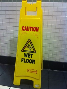
Citation: http://www.flickr.com/photos/christian-trabold/5872037849/sizes/m/in/photostream/


Rhetorical Analysis:  Caution signs normally make me laugh as they seem like common sense but how they are designed is the epitome of balance.  I’ll be short on this and not try to drag this out to make it look like I wrote more on a wet floor sign than anyone should.  It’s a wet floor sign it conveys the floor is wet that is all there is to it.  The person who placed it doesn’t want someone to fall and sue hence there are signs like this in any place that is public and has wet floors.

Design Analysis:  As for the design of a wet floor sign there are a lot of design elements at play here.  The balance is key the words need to be pig enough to be read before someone reaches the wet floor.  The image needs to be simplistic and easily understood but not so large it takes up space needed for text.  It is also bright yellow with hard black or red text making it easy to see and read.  Also, it falls back on repetition as everyone knows what the signs says before they actually read it.  Everyone knows a propped up yellow sign in the middle of a floor means it’s wet.  These design elements were all considered when designing the perfect way to let people know the floor is a slip and fall hazard.


10-16-12 note Taking Chapter 8

Posted by FHruska on October 23, 2012
Posted in: Uncategorized. Leave a Comment

If anyone has any concerns about image editing check out http://www.gimp.org/ they have a forum which will help answer most image editing questions.

Brief Summary

Image editing is not that complex but plays a large role in how images are presented.  There are simple editing programs and highly complex ones depending on the level of manipulation needed.  Manipulation is an odd word to use but it makes sense as the image is being manipulated to fit the need of the editor.  An image can convey a lot more than words and takes almost no time to view.  Hence, images are starting to replace text as important.  Photography is still a relatively new concept.  We are just starting to see the power of mass medias ability to share an image.  These images need to be presented in a way that conveys information but yet does not distract from the worded message.  this is not to say some images do not stand on their own.  a lot of images are starting to convey more meaning with less words.  The cliche a picture is worth a thousand words is becoming more and more true as we see the ability of images to be used in multiple mediums to convey a greater message.

Personal Experience

A lot of companies I write for want images to be linked to their sites.  The reason for this is to increase traffic through Google image search.  Google images can also be used as a way to generate web traffic and with more people looking for images than articles it has become a key part of the business.  Linking out to a photo is a little difficult as not all companies follow the guide lines when it comes to copy right laws.  That is why it is important to make sure the image you are editing or using is legally permitted to be manipulated.  I use the term manipulate again as I like the connotation that an image can be changed to convey a different meaning.  It has become amazing to see how a simple filter or cropping can drastically alter an images meaning.   There are people who dedicate their lives to graphic design and with how fast the world of image editing is growing it seems to be a stable market.  It has been joked that with how easy image editing has become everyone with a camera phone now thinks they are a photographer.  Which is killing the professional photography field with image editing being easier than ever and high quality cameras being built into phones it will be interesting to see how professional photography competes.

Questions With Discussion

Did you find this chapter boring?

I personally did as I feel it didn’t teach much about digital writing it just gave us a brief over view of image editing.  There is more to the field than a chapter can cover.  Doing a Google search for “free image editing” brings in tons of results which can teach us more than the chapter tried to.

Images or words what works for you?

Images work better for me the term visual learner is becoming obsolete as no one is actually a visual learner we just grew up in a visual culture.  The need to read and research is becoming obsolete as there is a YouTube video on just about everything.  It will be interesting to see when textbooks are replaced by online mediums made by open source contributors.  With image editing and mass media so readily available it is amazing anything survives in print form any more.

What affect do you feel an image can create?

The answer is basic that an image can trigger any emotion.  The thing to remember is an image can be interpreted different ways by different people just as writing can.  It is important when using images to make sure the right emotion is triggered which is why images are studied thoroughly.

Link To Summarize

Here is a link for “How Far Image Editing Can Go” to get an idea on how much an image can truly be manipulated.

10-16-12 Rhetoric on the Town

Posted by FHruska on October 23, 2012
Posted in: Uncategorized. Leave a Comment

citation: http://www.flickr.com/photos/expressmonorail/4479913297/sizes/o/in/photostream/


Rhetorical Analysis:  These types of displays are commonly seen in stores as the repetition catches people’s eye.  The goal of these displays are to attract customers over to buy the product off of the cool looking display.  Passing by an item on a shelf is quite easy but passing buy a structure made out of a product is quite difficult.  The other purpose of these displays is for name recognition.  company’s pay a decent amount of money to put these displays up where customers will see them.  Hence they want to make sure the next time you past by their product you recognize it.  The goal of any company is name recognition once that is established the rest is quite easy.  Hence, in this case coke wants to make sure everyone knows what their logo looks like.  It is quite difficult to miss this type of display making the image stick in a person’s mind.

Design Analysis:  The key point Coke is focusing on here is repetition.  They hope by consumers seeing a lot of their product they recognize the logo.  they want it so that a customer is exposed to Coke more than any other brand.  it maybe subliminal but they have done the studies to prove simply by over saturating an image it becomes the default for a person’s mind.  Coke aim with displays like this is for when a person goes out to eat and sees Coke products they instinctively order one. Next, time you order a Coke see if you actually wanted it or did it instinctively pop into your head that they have Coke hence I’ll get Coke.  Coke does not want people rationalizing this as it accounts for a lot of their sales.  The point is Coke has over saturated their logo so everyone will know what it is and want it.  The Coke pyramid above has over a 100 bottles in it therefore when you look at it you have now been exposed to Coke at least a hundred times.  this logic prevails as competitors try to make bigger displays to make sure you see their name just one more time.  These repetition displays are nothing more than companies trying to condition consumers to buy their product by default.


10-2-12 In Class Activity

Posted by FHruska on October 3, 2012
Posted in: Uncategorized. Leave a Comment

Coke knows just about everyone drinks soda the problem Coke needs to solve is how to make people but Coke when they go to the store.  The image is quirky and funny.  The ad could specifically target children who will remember this ad when they go to the grocery store with their parents.  The Coke product is displayed along with their logo to attract attention to what you will be looking for on the shelves.  Also, everyone has been to a restaurant and said Coke to hear is Pepsi okay.  The point of this is Coke wants to be the default cola people ask for.  To do this they must saturate the market with images that will stick.  Coke produces tons of images similar to this as they need to make the image stick.  That when potential customers see a polar bear or penguin their mind immediately thinks Coke even if the penguin or polar bear has nothing to do with Coke.  Being able to associate a product with something that has nothing to do with said product is an advertisers dream.

10-2-12 Note Taking

Posted by FHruska on October 2, 2012
Posted in: Uncategorized. Leave a Comment

For anyone unfamiliar with uask.com check out this link http://www.usask.ca/education/coursework/skaalid/theory/cgdt/emphasis.htm which does an excellent job explaining what the chapter is about without being boring.

Brief Summary

With the Wikipedia project being due this week I was happy to see the homework assignment was quite easy.  The reason I say the homework was easy is it tied into C.R.AP. design which we learned about extensively last week.  The main point of this chapter was the importance of emphasis.  Emphasis is easy to explain in that it is basically drawing attention to where you want it.  Emphasis is also important to attract reader’s to what is important.  This is seen in textbooks where they bold words.  Web design and graphic design are essentially just figuring out the best way to bold an idea or concept so the reader gets the most out of it.

Personal Experience

As I have said before I write a lot for the internet.  The number one reason posts get kicked back is due to emphasis.  Emphasizing the wrong part of an otherwise good post could discourage a lot of writers.  I have had post rejected then chose to emphasize a different part to have them accepted.  This shows that it is not always what you say but rather how it is presented that matters.  Emphasis should be used to compliment an idea not sell it.  On that same note emphasis can destroy an otherwise good point if the wrong area is emphasized.  All too often I read a post that got rejected solely cause the writer did not understand emphasis.  I enjoy this class mainly due to the fact it is applicable to my life.  All too often you will hear student’s say “when will I ever use this”.  Hence, I am happy to find a class that helps me in my writing.

Questions With Discussion

What do you think the importance of emphasis is?

I would say emphasis is important as it is a simple concept that takes time to master.  The tenants of it are easy to summarize in the sense of be visually appealing and attract attention.  This is a simple idea but all too many websites fail to meet basic emphasis requirements.

Have you ever had a bad experience with emphasis?

I covered this in my personal experience but I think other’s will have similar experiences with teachers that do not know how to use black board.  I also notice a lot of professor’s power points do little to keep student’s attention.  Emphasis is critical to the learning process yet so many instructors fail to rationalize this as stated in the beginning of the chapter.

How Does This Image Reflect Good/Bad Emphasis Design?

Wiki Work

Posted by FHruska on September 25, 2012
Posted in: Project 1. Leave a Comment

I worked on the appropriation, play, simulation, and McLuhan page.

Appropriation: Provided examples and images for how appropriation is applicable to society.

Play: Cleaned up the section and added some thoughts.  I’m at a bit of a writer’s block on this as it seems play is too broad to narrow down.

Simulation: Added reference at the bottom.

McLuhan: Explained how the video applied and explained his metaphors.

9/25 Notes: C.R.A.P. Design

Posted by FHruska on September 25, 2012
Posted in: reading notes. 1 comment

Brief Summary

I focused on the videos for a key reason they are the most relevent to this subject matter.  YouTube follows the basis of CRAP design perfectly.  While watching the video I saw how YouTube and other popular sites such as Google, Yahoo, and Bing all follow these design principles.  C.R.A.P. can be summarized below.

1. Contrast
The idea behind contrast is to avoid elements on the page that are merely similar. If the elements (type, color, size, line thickness, shape, space, etc.) are not the same, then make them very different. Contrast is often the most important visual attraction on a page.

  • Can you see the difference between your content, ads, headings, body copy and comments?

2. Repetition
Repeat visual elements of the design throughout the piece. You can repeat color, shape, texture, spatial relationships, line thicknesses, sizes, etc. This helps develop the organization and strengthens the unity.

  • Do you have a consistent theme or brand throughout your site? Do you reuse the same colour, shapes, blockquotes, formatting for all of your articles?

3. Alignment
Nothing should be placed on the page arbitrarily. Every element should have some visual connection with another element on the page. This creates a clean, sophisticated, fresh took,

  • Does everything line up or have you got things centred, left aligned or out of place?

4. Proximity
Items relating to each other should be grouped close together. When several items are in close proximity to each other, they become one visual unit rather than several separate units. This helps organize information and reduces clutter.

  • Can you find everything you need on your page easily? What is it that your visitors are looking for?

Contrast, Repetition, Alignment, Proximity = CRAP

When you gather these four principles of design theory, the appropriate and memorable acronym is CRAP. Sorry about that.( http://www.dailyblogtips.com/crapthe-four-principles-of-sound-design/)

I did not choose to copy and paste out of laziness but to show why C.R.A.P. is so important.  I was able to Google “C.R.A.P design” and be immediately brought to a website that explained.  If the first link was not relevant, well-versed, and visually appealing it usually would not be the first result on Google.  The ability for websites to be rememberable and easy to navigate is key to them generating traffic.  This need for web traffic has made a majority of websites conscious of how important it is their users can understand their sites.  By following these simple steps a bland website can become a work of art.

Experience and Discussion

I know enough about SEO writing but I generally never get to apply it to a class so I’ll take the opportunity when it is presented.  Many web based companies approach us and before we take on a client we want to make sure it is worth our effort.  Nothing will get us to turn down a client faster than poor website design.  I have seen far too many websites that look like they were made on Geocites (that’s still relevant, I hope).  There are professional multimillion dollar companies out there where their websites look like they let their ten year old child have a field day.  I have actually had to redo some companies websites before I could start writing for them as Google would notice there is no way this site is getting traffic looking this way.  On another note I have seen plenty of small businesses with astounding websites normally due to the fact they follow these design principles.  I was more disappointed that with my knowledge of web design I have never heard this acronym.  I figured designing an appealing website was just common sense and technical skill.  I never thought there was actually a proper way to do it.  To me as long as a website is visually appealing and can be easily navigated it is a good website.  I never thought there was an actual formula to follow.  I can’t wait to see another bad website so I can send them these videos.

http://www.youtube.com/watch?v=AEt4wAllxAc&feature=related

http://www.youtube.com/watch?v=AEt4wAllxAc&feature=related

http://www.youtube.com/watch?v=mF_mWi6r-9I

That may sound harsh but some companies need a wake up call that in the twenty-first century digital prominence is key to success.

These are different examples of how a well crafted web page should look. there are many options but as long as they follow the basis of C.R.A.P. design the end result is all the same. (http://jou1114.livejournal.com/16668.html)

Questions With Discussion

Is website design common sense or a developed skill?

Before watching the videos and reading the articles I would have said designing an appealing website is common sense.  After, my research I now acknowledge it as a developed skill.  The reason I did not think too much of it is because I grew up with digital writing and web site design as a fundamental part of my life.  I cannot remember when I learn how to use Microsoft Office or design a website.  I know I did not always know how to but it seems now children are learning these skills earlier and earlier.  As stated before the things we need to learn are changing.  The fact there are videos and articles about this shows it is not an easy skill to master.  The concept is easy to master but the application is difficult.

Can credibility be ruined by bad website design?

I would have to say yes.  A website can have accurate information from a reliable source but nine times out of ten if the website design is poor a professor will assume it is a bad source.  On the other side Wikipedia can be unreliable but due to its expert design and user base they tend to be the number one search result.  Hence, we need to be cautious of potential bad information from a well-crafted website.  Just as we shouldn’t dismiss potentially great information from a poorly designed website.  The problem is website design is now the epitome of judging a book by its cover.

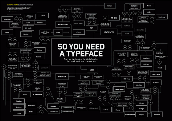
C.R.A.P. Design explained via typeface and how the type face you choose can affect your message. (http://rouletterevolver.wordpress.com/2011/05/09/fonts-and-c-r-a-p-indesign-dvd-cover/)

Blog Post Replies: Thank You For Including The Class

Posted by FHruska on September 25, 2012
Posted in: Uncategorized. 1 comment

When I started this assignment I figured I just click on the first five blogs leave some comment about how great their writing was and that I liked their format.  Then get credit for the assignment and continue on with my day.  Instead I found myself reading for hours and actually choosing what one’s to comment on.  The best part about this class is seeing how each of us interpreted the reading.  The reading is left open for a lot of discussion and seeing some people share my ideas validated my writing.  There were blogs that I disagreed with but they presented their point intelligently.  There were other post that gave me ideas I wouldn’t have thought of.  A lot of professors just lecture but this class allows us to learn from each other which I feel is where real learning happens.  Thank you for the opportunity for us to learn from each other rather than talking to us for three hours a night.

http://www.lglos001.students.digitalodu.com/?p=59#comment-14

http://mdavi117.students.digitalodu.com/?p=32#comment-10

http://vsimo001.students.digitalodu.com/?p=87#comment-9

http://mquer005.students.digitalodu.com/?p=19#comment-11

http://rschn009.students.digitalodu.com/?p=9#comment-8

9/18 Note Taking

Posted by FHruska on September 25, 2012
Posted in: reading notes. 1 comment

The reading was quite extensive and in my opinion over explained to people who already understand how far technology has advanced for an easier read which explains the future of technology and new media check out this website.

Brief Summary

            I was a little hesitant to write a summary on a 30 page document but while reading it I realized it was most of what we had already learned.  The article summarizes what new media is defined as and the advancements that have made new media possible.  New media is a relatively new term but it truly refers to the newest way to have media reach the masses.  He argues that at one time the printing press was new media.  He goes through all the steps that have allowed for the internet to be created starting with punch cards.  No one relates punch cards to the internet immediately but they were the first way of storing information to be retrieved later in a digital format.  Then he goes through the advancements of computers.  He warns us though that computers and media are advancing so rapidly soon there has to be a stopping point.  I wondered what he meant by this as it seems we would just keep on going infinitely until we are living like the Jetsons.  The fact is technology advances allowing for new ways to do old tasks.  He is for new media in the sense it is efficient and effective but he warns of the dangers of this.  That when so many people can contribute not necessarily in a positive manner technology may have already advanced too far.  Giving everyone access to an audience to say whatever they like may not be the best use of technology.  I have to say I agree as it is just a matter of time before literally anything is on the internet which we are already on the path for.  He also speaks about the people responsible for these advancements in depth but I would rather focus on how geniuses are not needed to use new media.  It takes a genius to make the software but to use it anyone with access to a computer can figure it out.  He likens it to when cars first came out everyone had to learn to drive.  In today’s world we all need to learn to use new media.  He elaborates on the development of theaters and how they provided an escape from reality while providing a new advertising medium.  Today it is hard to think of a world where there isn’t media flooding every facet of our life which is the main point the articles tries to make at which point is enough, enough.  He tries to give rules for classifying new media but the general guideline is if it’s a new way of reaching an audience that has not been seen before its new media.

Technology Advancement Timeline (http://blogs.imediaconnection.com/blog/2011/01/17/making-social-media-more-accessible-to-brands/)

Personal Experience

I know I write about being a writer for an SEO company a lot in my blog and for that I apologize.  This topic ties into SEO writing perfectly though. Search engines are where everyone turns to get their information now they are the epitome of new media.  The company I work for is always trying to find the newest most effective way to reach more people.  That is what we do for a living we make your piece of media accessible to more people.  The fact companies like this exist shows how much companies are willing to pay to make sure the internet recognizes them.  Before, companies relied on print, then radio, then movies, then television, it’s only logical they would advance online.  The problem is so much information is available online how do you make sure your piece of media is recognized.


Questions With Discussion

When will we consider are technology archaic?

Looking back most technological advancements are less than a hundred years old yet we consider them out of date and useless.  How long before we look at our technology and wonder how we ever used it.  I recently got a smart phone and within six months of having mine I wondered how I ever survived without it.  I use the term survive on purpose that my smart phone is not necessary for my survival but makes life so easy it is amazing how society operated before them.  This sounds pretentious but when you see someone using an outdated piece of technology you wonder why they would choose to do that.  How long before the gap of technology becoming out dated is within days of buying the state of the art product.  Now technology becomes out dated every six months and that number is only becoming lower as time goes on.  We live in a time when research and development are constantly pushing themselves to be at the top of the market cause falling behind would drop them into obscurity.

What do you think is the most important technological advancement in the past hundred years and why?

I’ll take the obvious answer of the internet as it has revolutionized the world around us.  Congress is currently trying to pass a bill to tax online sales because of how fast the internet expanded.  New laws on privacy and free speech have been debated.  Copy right law as we learned in previous lessons has become a major issue.  The internet is creating new and interesting ways to do just about anything and the legislative process cannot keep up.  As a legal geek these scenarios amuse me anytime someone can create something that laws do not apply to yet is highly interesting to me.  The fact the internet age has made politicians dumb founded is just a testament to who should be in office instead of the currently elected bodies.

Posts navigation

← Older Entries
Newer Entries →
  • Recent Posts

    • Course Portfolio
    • Linkedin
    • Video Resume
    • Timeline
    • Scannable Resume
  • Recent Comments

    • Shelley Rodrigo on Read and Respond
    • Shelley Rodrigo on Rhetoric on the Town 7 Elements
    • Shelley Rodrigo on 10-23-12 Rhetoric on The Town
    • Shelley Rodrigo on 9/18 Note Taking
    • Shelley Rodrigo on Blog Post Replies: Thank You For Including The Class
  • Archives

    • December 2012
    • November 2012
    • October 2012
    • September 2012
    • August 2012
  • Categories

    • Project 1
    • reading notes
    • Uncategorized
  • Meta

    • Log in
    • Entries feed
    • Comments feed
    • WordPress.org
Proudly powered by WordPress Theme: Parament by Automattic.