Brief Summary
I focused on the videos for a key reason they are the most relevent to this subject matter. YouTube follows the basis of CRAP design perfectly. While watching the video I saw how YouTube and other popular sites such as Google, Yahoo, and Bing all follow these design principles. C.R.A.P. can be summarized below.
1. Contrast
The idea behind contrast is to avoid elements on the page that are merely similar. If the elements (type, color, size, line thickness, shape, space, etc.) are not the same, then make them very different. Contrast is often the most important visual attraction on a page.
- Can you see the difference between your content, ads, headings, body copy and comments?
2. Repetition
Repeat visual elements of the design throughout the piece. You can repeat color, shape, texture, spatial relationships, line thicknesses, sizes, etc. This helps develop the organization and strengthens the unity.
- Do you have a consistent theme or brand throughout your site? Do you reuse the same colour, shapes, blockquotes, formatting for all of your articles?
3. Alignment
Nothing should be placed on the page arbitrarily. Every element should have some visual connection with another element on the page. This creates a clean, sophisticated, fresh took,
- Does everything line up or have you got things centred, left aligned or out of place?
4. Proximity
Items relating to each other should be grouped close together. When several items are in close proximity to each other, they become one visual unit rather than several separate units. This helps organize information and reduces clutter.
- Can you find everything you need on your page easily? What is it that your visitors are looking for?
Contrast, Repetition, Alignment, Proximity = CRAP
When you gather these four principles of design theory, the appropriate and memorable acronym is CRAP. Sorry about that.( http://www.dailyblogtips.com/crapthe-four-principles-of-sound-design/)
I did not choose to copy and paste out of laziness but to show why C.R.A.P. is so important. I was able to Google “C.R.A.P design” and be immediately brought to a website that explained. If the first link was not relevant, well-versed, and visually appealing it usually would not be the first result on Google. The ability for websites to be rememberable and easy to navigate is key to them generating traffic. This need for web traffic has made a majority of websites conscious of how important it is their users can understand their sites. By following these simple steps a bland website can become a work of art.
Experience and Discussion
I know enough about SEO writing but I generally never get to apply it to a class so I’ll take the opportunity when it is presented. Many web based companies approach us and before we take on a client we want to make sure it is worth our effort. Nothing will get us to turn down a client faster than poor website design. I have seen far too many websites that look like they were made on Geocites (that’s still relevant, I hope). There are professional multimillion dollar companies out there where their websites look like they let their ten year old child have a field day. I have actually had to redo some companies websites before I could start writing for them as Google would notice there is no way this site is getting traffic looking this way. On another note I have seen plenty of small businesses with astounding websites normally due to the fact they follow these design principles. I was more disappointed that with my knowledge of web design I have never heard this acronym. I figured designing an appealing website was just common sense and technical skill. I never thought there was actually a proper way to do it. To me as long as a website is visually appealing and can be easily navigated it is a good website. I never thought there was an actual formula to follow. I can’t wait to see another bad website so I can send them these videos.
http://www.youtube.com/watch?v=AEt4wAllxAc&feature=related
http://www.youtube.com/watch?v=AEt4wAllxAc&feature=related
http://www.youtube.com/watch?v=mF_mWi6r-9I
That may sound harsh but some companies need a wake up call that in the twenty-first century digital prominence is key to success.

These are different examples of how a well crafted web page should look. there are many options but as long as they follow the basis of C.R.A.P. design the end result is all the same. (http://jou1114.livejournal.com/16668.html)
Questions With Discussion
Is website design common sense or a developed skill?
Before watching the videos and reading the articles I would have said designing an appealing website is common sense. After, my research I now acknowledge it as a developed skill. The reason I did not think too much of it is because I grew up with digital writing and web site design as a fundamental part of my life. I cannot remember when I learn how to use Microsoft Office or design a website. I know I did not always know how to but it seems now children are learning these skills earlier and earlier. As stated before the things we need to learn are changing. The fact there are videos and articles about this shows it is not an easy skill to master. The concept is easy to master but the application is difficult.
Can credibility be ruined by bad website design?
I would have to say yes. A website can have accurate information from a reliable source but nine times out of ten if the website design is poor a professor will assume it is a bad source. On the other side Wikipedia can be unreliable but due to its expert design and user base they tend to be the number one search result. Hence, we need to be cautious of potential bad information from a well-crafted website. Just as we shouldn’t dismiss potentially great information from a poorly designed website. The problem is website design is now the epitome of judging a book by its cover.
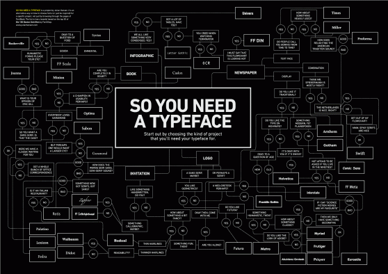
C.R.A.P. Design explained via typeface and how the type face you choose can affect your message. (http://rouletterevolver.wordpress.com/2011/05/09/fonts-and-c-r-a-p-indesign-dvd-cover/)
Thanks for “getting” the note taking assignment and engaging it well. I’m “thrilled” you are picking up tidbits that are useful. Since you already know/experience a lot of the content in the course, be sure to adapt assignment in a way that make the course useful to you. You can always chat with me about ways to adapt assignments (both big and little).